carData > Bfox

Linux 사례 (MX 21)
Linux 사례 (MX 21)

data(Bfox, package="carData")

Bfox 데이터셋이 활성화되었다면, 도움말 기능을 통하여 데이터셋의 정보를 확인할 수 있다.

Linux 사례 (MX 21)


Bfox {carData} R Documentation

Canadian Women's Labour-Force Participation

Description

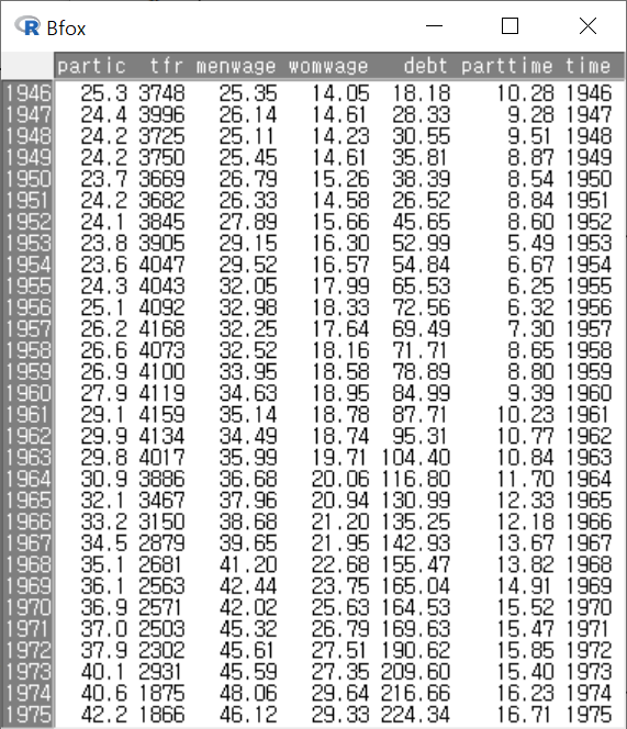
The Bfox data frame has 30 rows and 7 columns. Time-series data on Canadian women's labor-force participation, 1946–1975.

Usage

Bfox

Format

This data frame contains the following columns:

partic

Percent of adult women in the workforce.

tfr

Total fertility rate: expected births to a cohort of 1000 women at current age-specific fertility rates.

menwage

Men's average weekly wages, in constant 1935 dollars and adjusted for current tax rates.

womwage

Women's average weekly wages.

debt

Per-capita consumer debt, in constant dollars.

parttime

Percent of the active workforce working 34 hours per week or less.

Warning

The value of tfr for 1973 is misrecorded as 2931; it should be 1931.

Source

Fox, B. (1980) Women's Domestic Labour and their Involvement in Wage Work. Unpublished doctoral dissertation, p. 449.

References

Fox, J. (2016) Applied Regression Analysis and Generalized Linear Models, Third Edition. Sage.


[Package carData version 3.0-5 Index]

그래프 > 선 그래프...
Graphs > Line graph...

Windows 사례 (10 Pro)

선 그래프(Line graph/ lineplot)는 주로 시계열적인 흐름을 가진 수치형 변수의 변화를 점검할 때 사용한다.

1. carData 패키지에 있는 Bfox 데이터셋을 활성화시키자. Bfox 데이터셋이 활성화된 후, R Commander 화면에서 <데이터셋보기> 버튼을 눌러보자. 행의 이름이 연속형 숫자인 연도로 되어있다.
2. 연도형 행 이름을 time 이라는 변수로 전환시켜보자. 아래 <새로운 변수 계산하기> 창의 <계산 표현식>을 참고하라.

data(Bfox, package="carData")
Bfox$time <- with(Bfox, as.numeric(rownames(Bfox)))

Windows 사례 (10 Pro)

아래와 같이 데이터셋 내부 구성이 보일 것이다.

Windows 사례 (10 Pro)

Bfox 데이터셋에서 새롭게 만든 변수 time을 <x 변수 (하나 선택)>에서 선택하고, <y 변수 (하나 이상 선택)>에 주별(weekly) 남성급여, 여성급여를 뜻하는 menwage, womwage 두 변수를 선택한다. y 변수에 두개의 변수를 선택했다는 것은 두개의 선그래프가 time 변수의 흐름에 따라 만들겠다는 의미이기도 하다.

Windwos 사례 (10 Pro)

with(Bfox, lineplot(time, menwage, womwage))

그래픽장치 창에 다음과 같은 선 그래프가 출력된다. 1946년부터 1975년까지의 남성과 여성의 주급(weekly wage)의 변화를 보게된다.

Windows 사례 (10 Pro)

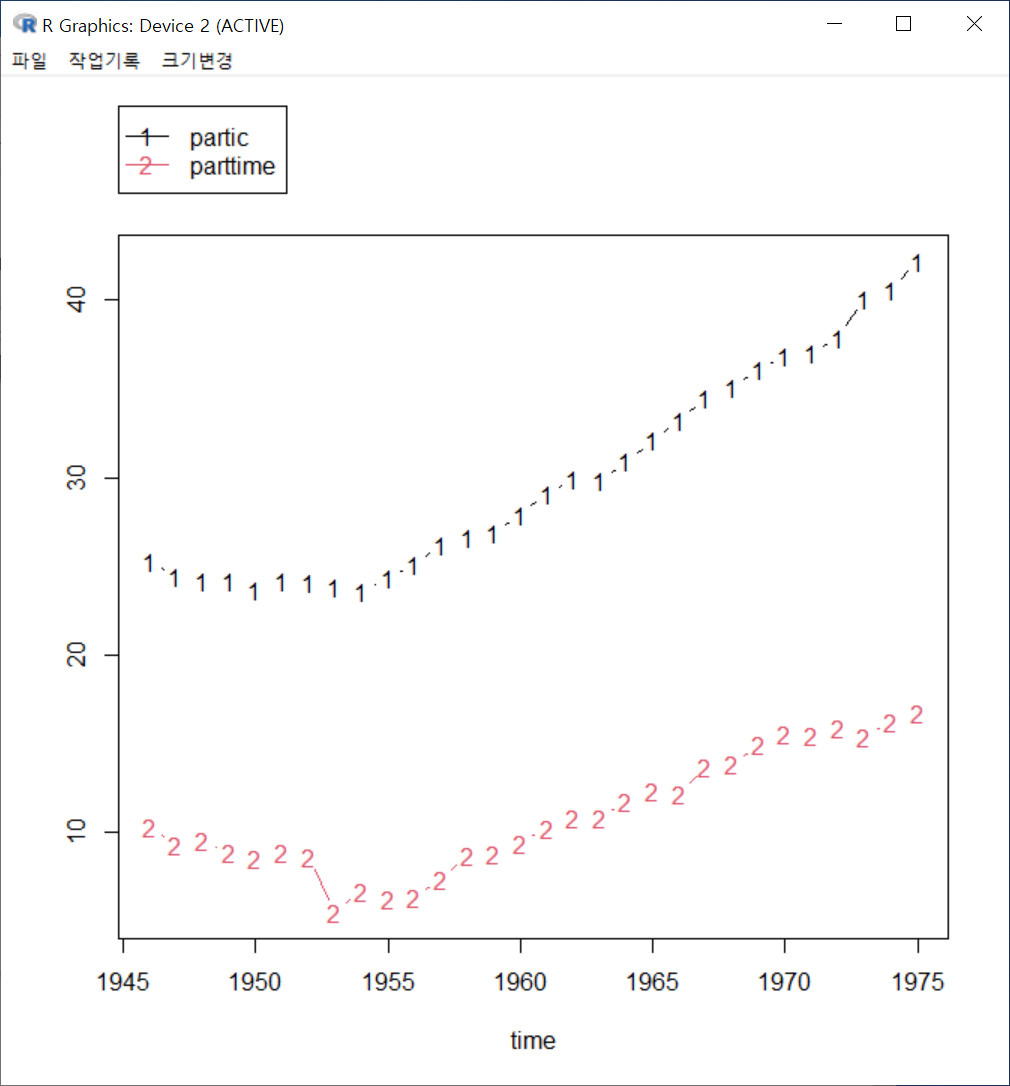
또 다른 선 그래프를 만들어보자. partic은 노동인구내의 여성비율, parttime은 주당 34시간 이내의 시간제노동 비율이다. 이 두 변수의 연도별 변화 추이를 살펴보기 위하여 선 그래프를 만든다면 아래와 같을 것이다:

Windows 사례 (10 Pro)

선 그래프를 만드는데 가장 기본적인 출발점은 x 변수에 시간적 흐름을 갖는 변수를 선택하는 것이다. 만약 시계열적 수치형 변수가 선택되지 않는다면, 선그래프는 시사점을 가지 못하는 불규칙한 그림을 갖게 될 것이다. 예를 들어, carData에 있는 Prestige 데이터셋에는 시계열적 정보를 갖는 수치형 변수가 없다. prestige 변수를 x 변수에 놓고, education과 income을 y 변수에 놓고, 그래프를 그려보자.

Windows 사례 (10 Pro)

다음과 같은 경고문을 만나게된다. x 변수인 prestige 변수의 사례배열에 순서가 없다는 지시문을 보게된다.

Windows 사례 (10 Pro)
Windows 사례 (10 pro)


?lineplot  # RcmdrMisc 패키지의 lineplot 도움말 보기

 if (require("car")){
    data(Bfox)
    Bfox$time <- as.numeric(rownames(Bfox))
    with(Bfox, lineplot(time, menwage, womwage))
}

그래프 > 산점도 행렬...
Graphs > Scatterplot matrix...

Windows 사례 (10 Pro)

산점도(Scatterplot)는 두개의 수치형 변수 사이의 관계성을 시각적으로 보면서 통찰력을 얻고자 하는 기법이다. 그런데 세개 이상의 수치형 변수들을 함께 점검하면서 관계성을 시각화하고자 할 때, 산점도의 이용은 다소 불편함이 생긴다. 이 때 산점도 행렬(Scatterplot matrix)을 사용한다.
Prestige 데이터셋에서 네개의 수치형 변수를 점검한다고 하자. 교육연수, 연소득, 직업권위의식, 여성참여율 등과 관련된 변수들 네개를 선택하자.

Windows 사례 (10 Pro)

<선택기능> 창에서 <대각선에서>는 <밀도그림>을 선택하고, <다른 선택 기능>에서는 <최소-제곱 선>, <평활선>을 선택하고, 그래프 제목을 추가한다.

Windows 사례 (10 Pro)

scatterplotMatrix(~education+income+prestige+women, regLine=TRUE, 
  smooth=list(span=0.5, spread=FALSE), diagonal=list(method="density"), 
  data=Prestige, main="Prestige 데이터셋 주요변수들의 산점도 행렬")

아래와 같은 그래픽장치 창에 산점도 행렬이 등장한다. education, income, prestige, women 이라는 네개의 변수 각각의 밀도함수가 변수 이름과 함께 작성되어 있으며, 행렬 매 칸마다 두개의 변수 사이의 산점도가 제공된다. 행렬 칸 바깥에 있는 숫자들은 수치형 변수들의 사례 값 범위를 요약해서 보여준다.

Windows 사례 (10 Pro)

산점도행렬에는 많은 정보가 담겨있다. 확인하고자 하는 정보만을 부각시키고자 산점도행렬을 단순화시키는 노력이 요구된다.


?scatterplotMatrix  #  car 패키지의 scatterplotMatrix 도움말 보기

scatterplotMatrix(~ income + education + prestige | type, data=Duncan)
scatterplotMatrix(~ income + education + prestige | type, data=Duncan,
    regLine=FALSE, smooth=list(span=1))
scatterplotMatrix(~ income + education + prestige,
    data=Duncan, id=TRUE, smooth=list(method=gamLine))

+ Recent posts