그래프 > 이산형 수치 변수 그리기...

Graphs > Plot discrete numeric variable...

Linux 사례 (MX 21)

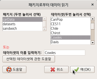
carData 패키지의 Cowles 데이터셋을 활용해서 연습해보자.

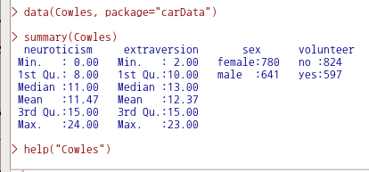
data(Cowles, package="carData") # Cowles 데이터셋 불러오기
summary(Cowles)                 # Cowles 데이터셋의 요약정보 보기 (변수이름, 사례요약)

외향성을 의미하는 이산형 수치 변수인 extraversion을 선택한다.

Linux 사례 (MX 21)

요인형 변수 목록에 sex와 volunteer가 있다. volunteer를 선택한다.

Linux 사례 (MX 21)

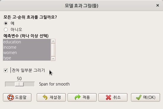
<선택기능> 창의 선택 기능중에서 <축 크기조정>에 '백분율"을 선택한다. 그리고 <그림 이름표>에는 내용적 이해를 돕는 사항들을 넣을 수 있다.

Linux 사례 (MX 21)

아래와 같이 그래픽 창에 '이산형 수치 변수' extraversion의 백분율 분포가 자원봉사 지원 여부인 volunteer 변수의 요인형 수준인 'no', 'yes' 별로 그래프화된다.

Linux 사례 (MX 21)

with(Cowles, discretePlot(extraversion, by=volunteer, scale="percent", xlab="외향성 (extraversion)",
   ylab="비율 (%)", main="자원봉사 지원여부 그룹에 따른 외향성 분포"))

<관련 사항>

- Cowles 데이터셋 이해하기 -> https://rcmdr.tistory.com/154


Cowles 데이터셋

carData > Cowles data(Cowles, package="carData") help("Cowles") Cowles {carData} R Documentation Cowles and Davis's Data on Volunteering Description The Cowles data frame has 1421 rows and 4 co..

rcmdr.kr


?discretePlot  # RcmdrMisc 패키지의 discretePlot 도움말 보기

if (require(datasets)){
  data(mtcars)
  mtcars$cyl <- factor(mtcars$cyl)
  with(mtcars, {
    discretePlot(carb)
    discretePlot(carb, scale="percent")
    discretePlot(carb, by=cyl)
  })
}

모델 > 그래프 > 효과 그림...

Models > Graphs > Effect plots...

Linux 사례 (MX 21)

'모델 > 그래프 > 효과 그림...' 기능은 미리 모델이 만들어져야 이용할 수 있다. 만들어진 모델은 아래와 같이 R Commander 상단에서 확인할 수 있다. carData 패키지의 Cowles 데이터셋으로 만든 GLM.1 모델을 활용하는 것이다.

Linux 사례 (MX 21)

<모델 효과 그림(들)> 창 중간에 있는 <예측변수 (하나 이상 선택)> 기능에서 sex, neuroticism, extraversion 세 변수를 모두 선택해보자.

Linux 사례 (MX 21)

plot(allEffects(GLM.1))

Linux 사례 (MX 21)


carData 패키지의 Prestige 데이터셋을 이용하여 연습해보자. 아래와 같이 prestige (직업의 사회적 권위)에 대한 education (교육연수), income (연수입), women (여성 참여율)의 영향력을 type (직업유형)별로 살펴보는 모델을 만들었다고 가정하자.

data(Prestige, package="carData")
LinearModel.1 <- lm(prestige ~ education + income + women + type, data=Prestige)
summary(LinearModel.1)

아래와 같이 LinearModel.1의 요약 정보가 출력될 것이다.

Linux 사례 (MX 21)

이러한 LinearModel.1의 효과 그림을 시각화 할 수 있다. <모델 효과 그림(들)> 창의 <예측변수(하나 이상 선택)> 기능에서 네개의 변수를 모두 선택해보자. 그리고 예(OK) 버튼을 누른다.

Linux 사례 (MX 21)

plot(allEffects(LinearModel.1))

아래와 같이 그래픽 장치 창에 선택된 변수 네개의 효과 그림이 등장할 것이다.

Linux 사례 (MX 21)

한편, <잔차 일부분 그리기> 기능을 선택해보자. 

Linux 사례 (MX 21)

그래픽 장치 창에 잔차들이 플롯으로 표시된다. 표시된 잔차의 분포를 보면서 추가로로 통찰력을 키울 수 있다.

Linux 사례 (MX 21)

'Models > Graphs' 카테고리의 다른 글

6. Influence index plot...  (0) 2022.06.21
2. Residual quantile-comparison plot...  (0) 2022.06.21
5. Influence plot...  (0) 2022.06.21
4. Added-variable plots...  (0) 2022.06.20
3. Component + residual plots...  (0) 2022.06.20

carData::Cowles

Linux 사례 (MX 21)

data(Cowles, package="carData")

Linux 사례 (MX 21)

help("Cowles")

Linux 사례 (MX 21)


Cowles {carData} R Documentation

Cowles and Davis's Data on Volunteering

Description

The Cowles data frame has 1421 rows and 4 columns. These data come from a study of the personality determinants of volunteering for psychological research.

Usage

Cowles

Format

This data frame contains the following columns:

neuroticism

scale from Eysenck personality inventory

extraversion

scale from Eysenck personality inventory

sex

a factor with levels: female; male

volunteer

volunteeing, a factor with levels: no; yes

Source

Cowles, M. and C. Davis (1987) The subject matter of psychology: Volunteers. British Journal of Social Psychology 26, 97–102.


[Package carData version 3.0-5 Index]

+ Recent posts