datasets::swiss()


?swiss  # swiss 데이터셋 도움말 보기

# 아래는 example(swiss) 입니다.

require(stats); require(graphics)
pairs(swiss, panel = panel.smooth, main = "swiss data",
      col = 3 + (swiss$Catholic > 50))
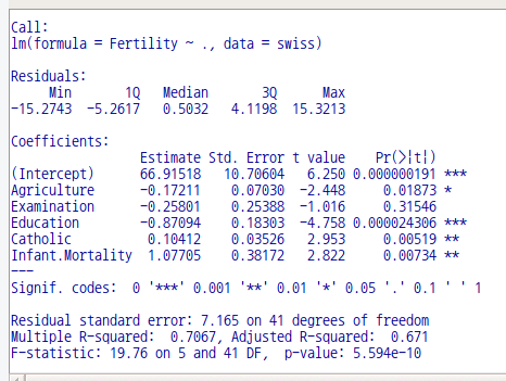
summary(lm(Fertility ~ . , data = swiss))

linux 사례 (MX 21)

pairs(swiss, panel = panel.smooth, main = "swiss data",
      col = 3 + (swiss$Catholic > 50))

pairs(swiss, panel = panel.smooth, main = "swiss data")  # 두 그래프를 비교해 보기

Linux 사례 (MX 21)
Linux 사례 (MX 21)

LinearModel.1 <- lm(Fertility ~ . , data = swiss)
summary(LinearModel.1)

Linux 사례 (MX 21)

'Dataset_info > swiss' 카테고리의 다른 글

swiss 데이터셋  (0) 2022.06.13

datasets::warpbreaks

?warpbreaks  # warpbreaks 도움말 보기

# 아래는 example(warpbreaks) 입니다.

require(stats); require(graphics)
summary(warpbreaks)
opar <- par(mfrow = c(1, 2), oma = c(0, 0, 1.1, 0))
plot(breaks ~ tension, data = warpbreaks, col = "lightgray",
     varwidth = TRUE, subset = wool == "A", main = "Wool A")
plot(breaks ~ tension, data = warpbreaks, col = "lightgray",
     varwidth = TRUE, subset = wool == "B", main = "Wool B")
mtext("warpbreaks data", side = 3, outer = TRUE)
par(opar)
summary(fm1 <- lm(breaks ~ wool*tension, data = warpbreaks))
anova(fm1)

Linux 사례 (MX 21)
Linux 사례 (MX 21)
Linux 사례 (MX 21)
Linux 사례 (MX 21)
Linux 사례 (MX 21)

'Dataset_info > warpbreaks' 카테고리의 다른 글

warpbreaks 데이터셋  (0) 2022.03.20

모델 > 그래프 > 기초 진단 그림

Models > Graphs > Basic diagnostic plots

Linux 사례 (MX 21)

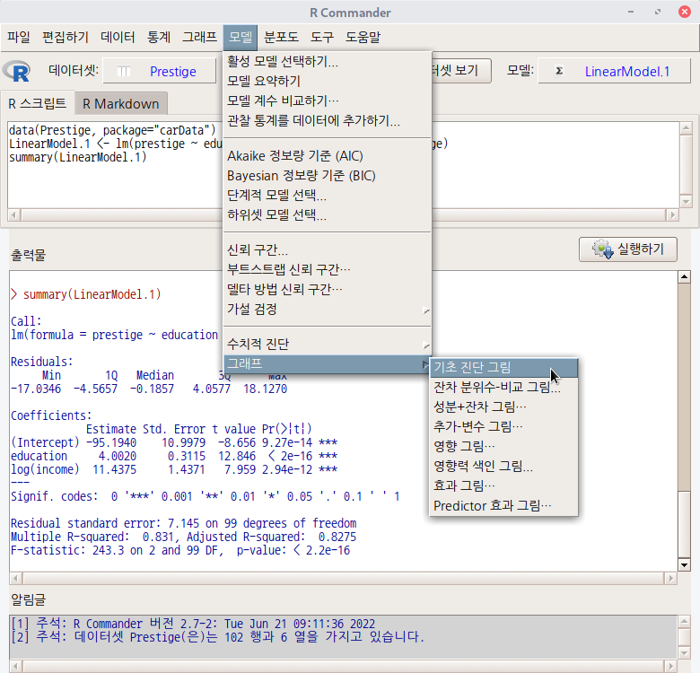
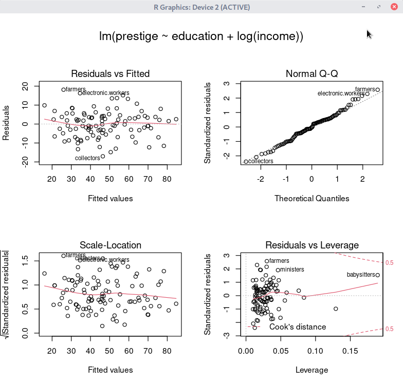
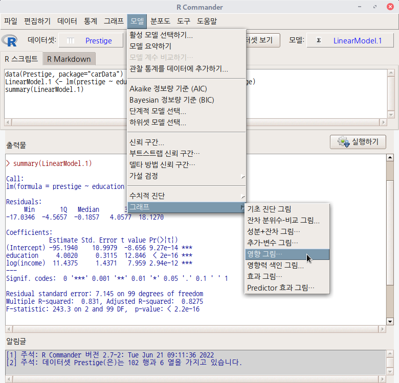
데이터셋을 활성화시키고, 분석 모형을 만들었다면, '모델 > 그래프 > 기초 진단 그림...' 메뉴 기능을 사용할 수 있다. carData 패키지의 Prestige 데이터셋을 이용하여 연습해보자.


먼저, Prestige 데이터셋을 활성화 시키자. '데이터 > 패키지에 있는 데이터 > 첨부된 패키지에서 데이터셋 읽기...' 메뉴 기능을 선택하고, 다음 화면에서 carData 패키지에 포함된 데이터셋들 중에서 Prestige를 찾아서 선택한다. 그러면, R Commander 상단의 <활성 데이터셋 없음> 버튼이 'Prestige'로 바뀐다.


Prestige 데이터셋을 이용하여 LinearModel.1 모형을 만든다. '통계 > 적합성 모델 > 선형 모델...' 메뉴 기능을 이용할 수 있다. 

LinearModel.1 <- lm(prestige ~ education + log(income), data=Prestige)
summary(LinearModel.1)

LinearModel.1 모형이 활성화된 이후, '모델 > 그래프 > 기초 진단 그림...' 메뉴 기능을 선택하면 아래와 같은 그래픽 장치 창이 등장한다.

Linux 사례 (MX 21)

oldpar <- par(oma=c(0,0,3,0), mfrow=c(2,2))
plot(LinearModel.1)
par(oldpar)

'Models > Graphs' 카테고리의 다른 글

8. Predictor effect plots...  (0) 2022.06.21
6. Influence index plot...  (0) 2022.06.21
2. Residual quantile-comparison plot...  (0) 2022.06.21
5. Influence plot...  (0) 2022.06.21
4. Added-variable plots...  (0) 2022.06.20

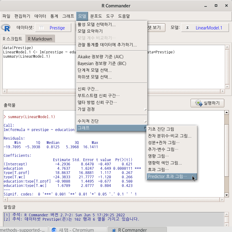
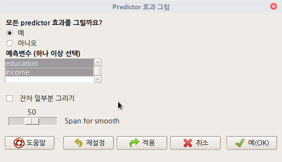
모델 > 그래프 > Predictor 효과 그림...
Models > Graphs > Predictor effect plots...

Linux 사례 (MX 21)

데이터셋을 활성화시키고, 분석 모형을 만들었다면, '모델 > 그래프 > Predictor 효과 그림...' 메뉴 기능을 사용할 수 있다. carData 패키지의 Prestige 데이터셋을 이용하여 연습해보자.

먼저, Prestige 데이터셋을 활성화 시키자. '데이터 > 패키지에 있는 데이터 > 첨부된 패키지에서 데이터셋 읽기...' 메뉴 기능을 선택하고, 다음 화면에서 carData 패키지에 포함된 데이터셋들 중에서 Prestige를 찾아서 선택한다. 그러면, R Commander 상단의 <활성 데이터셋 없음> 버튼이 'Prestige'로 바뀐다.

Prestige 데이터셋을 이용하여 LinearModel.1 모형을 만든다. '통계 > 적합성 모델 > 선형 모델...' 메뉴 기능을 이용할 수 있다.

LinearModel.1 <- lm(prestige ~ education + log(income), data=Prestige)
summary(LinearModel.1)

LinearModel.1 모형이 활성화된 이후, '모델 > 그래프 > Predictor 효과 그림...' 메뉴 기능을 선택하면 아래와 같은 하위 화면이 등장한다. 예측변수 두개를 모두 선택한다. 메뉴 창 오른쪽 끝 아래에 있는 예(OK) 버튼을 누른다.

Linux 사례 (MX 21)
Linux 사례 (MX 21)
plot(predictorEffects(LinearModel.1))

?predictorEffects   #  Predictor 효과 그림 도움말보기

'Models > Graphs' 카테고리의 다른 글

1. Basic diagnostic plots  (0) 2022.06.21
6. Influence index plot...  (0) 2022.06.21
2. Residual quantile-comparison plot...  (0) 2022.06.21
5. Influence plot...  (0) 2022.06.21
4. Added-variable plots...  (0) 2022.06.20

모델 > 그래프 > 영향력 색인 그림...

Models > Graphs > Influence index plot...

Linux 사례 (MX 21)

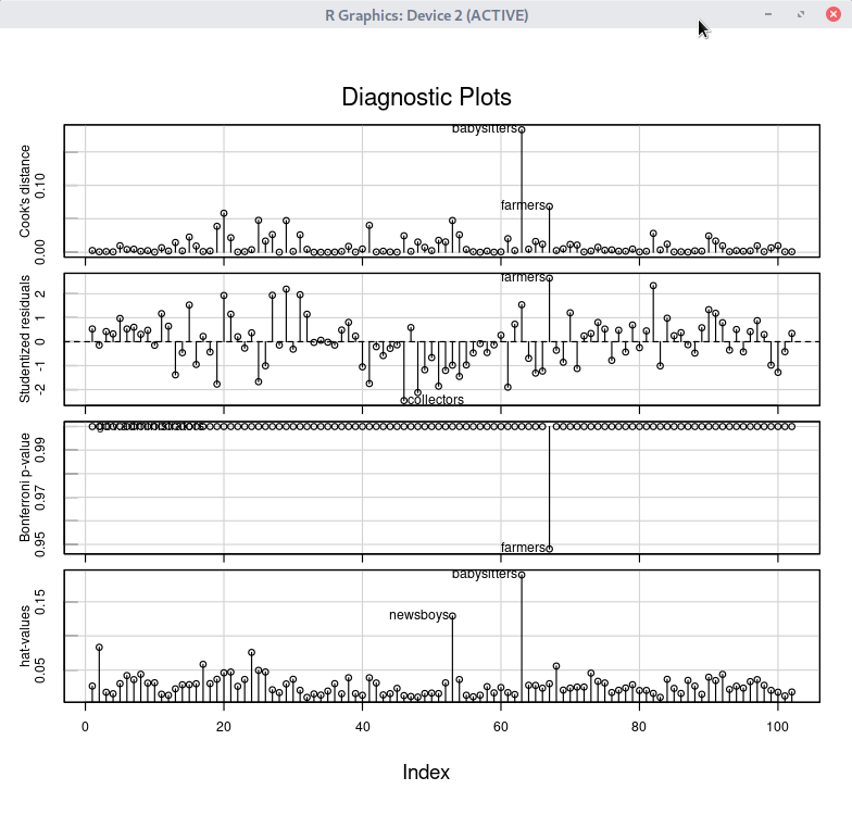
데이터셋을 활성화시키고, 분석 모형을 만들었다면, '모델 > 그래프 > 영향력 색인 그림...' 메뉴 기능을 사용할 수 있다. carData 패키지의 Prestige 데이터셋을 이용하여 연습해보자.


먼저, Prestige 데이터셋을 활성화 시키자. '데이터 > 패키지에 있는 데이터 > 첨부된 패키지에서 데이터셋 읽기...' 메뉴 기능을 선택하고, 다음 화면에서 carData 패키지에 포함된 데이터셋들 중에서 Prestige를 찾아서 선택한다. 그러면, R Commander 상단의 <활성 데이터셋 없음> 버튼이 'Prestige'로 바뀐다.


Prestige 데이터셋을 이용하여 LinearModel.1 모형을 만든다. '통계 > 적합성 모델 > 선형 모델...' 메뉴 기능을 이용할 수 있다. 

LinearModel.1 <- lm(prestige ~ education + log(income), data=Prestige)
summary(LinearModel.1)

LinearModel.1 모형이 활성화된 이후, '모델 > 그래프 > 영향력 색인 그림...' 메뉴 기능을 선택하면 아래와 같은 하위 화면이 등장한다. 메뉴 창 오른쪽 끝 아래에 있는 예(OK) 버튼을 누른다.

Linux 사례 (MX 21)
Linux 사례 (MX 21)

influenceIndexPlot(LinearModel.1, id=list(method="y", n=2), vars=c("Cook", "Studentized", "Bonf", 
  "hat"))

?influenceIndexPlot   # 영향력 색인 그림의 도움말 보기

'Models > Graphs' 카테고리의 다른 글

1. Basic diagnostic plots  (0) 2022.06.21
8. Predictor effect plots...  (0) 2022.06.21
2. Residual quantile-comparison plot...  (0) 2022.06.21
5. Influence plot...  (0) 2022.06.21
4. Added-variable plots...  (0) 2022.06.20

모델 > 수치적 진단 > Durbin-Watson 자기상관 검정...

Models > Numerical dignostics > Durbin-Watson test for autocorrelation...

Linux 사례 (MX 21)

데이터셋을 활성화시키고, 분석 모형을 만들었다면, '모델 > 수치적 진단 > Durbin-Watson 자기상관 검정...' 메뉴 기능을 사용할 수 있다. carData 패키지의 Prestige 데이터셋을 이용하여 연습해보자.


먼저, Prestige 데이터셋을 활성화 시키자. '데이터 > 패키지에 있는 데이터 >

첨부된 패키지에서 데이터셋 읽기...' 메뉴 기능을 선택하고, 다음 화면에서 carData 패키지에 포함된 데이터셋들 중에서 Prestige를 찾아서 선택한다. 그러면, R Commander 상단의 <활성 데이터셋 없음> 버튼이 'Prestige'로 바뀐다.


Prestige 데이터셋을 이용하여 LinearModel.1 모형을 만든다. '통계 > 적합성 모델 > 선형 모델...' 메뉴 기능을 이용할 수 있다. 

LinearModel.1 <- lm(prestige ~ education + log(income), data=Prestige)
summary(LinearModel.1)

LinearModel.1 모형이 활성화된 이후, '모델 > 수치적 진단 > Durbin-Watson 자기상관 검정...' 메뉴 기능을 선택하면 아래와 같은 하위 화면이 등장한다. 메뉴 창 오른쪽 끝 아래에 있는 예(OK) 버튼을 누른다.

Linux 사례 (MX 21)
Linux 사례 (MX 21)


?dwtest  # Durbin Watson 검정 도움말 보기

'Models > Numerical diagnostics' 카테고리의 다른 글

4. RESET test for nonlinearity...  (0) 2022.06.20
6. Response transformation...  (0) 2022.06.20
5. Bonferroni outlier test  (0) 2022.06.18
1. Variance-inflation factors  (0) 2022.06.14

모델 > 그래프 > 영향 그림...

Models > Graphs > Influence plot...

Linux 사례 (MX 21)

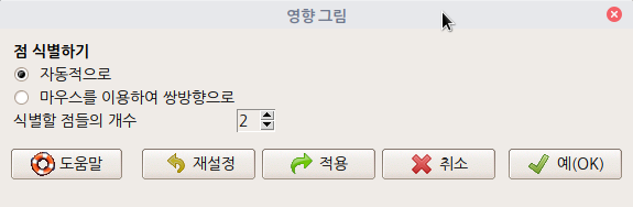
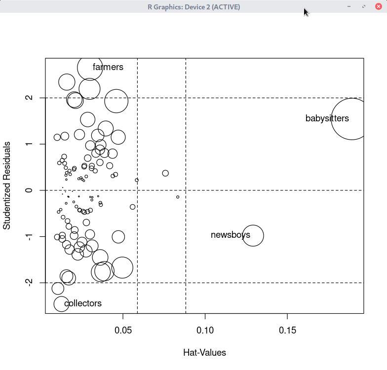
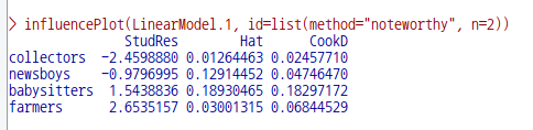
데이터셋을 활성화시키고, 분석 모형을 만들었다면, '모델 > 그래프 > 영향 그림...' 메뉴 기능을 사용할 수 있다. carData 패키지의 Prestige 데이터셋을 이용하여 연습해보자.


먼저, Prestige 데이터셋을 활성화 시키자. '데이터 > 패키지에 있는 데이터 > 첨부된 패키지에서 데이터셋 읽기...' 메뉴 기능을 선택하고, 다음 화면에서 carData 패키지에 포함된 데이터셋들 중에서 Prestige를 찾아서 선택한다. 그러면, R Commander 상단의 <활성 데이터셋 없음> 버튼이 'Prestige'로 바뀐다.


Prestige 데이터셋을 이용하여 LinearModel.1 모형을 만든다. '통계 > 적합성 모델 > 선형 모델...' 메뉴 기능을 이용할 수 있다.

LinearModel.1 <- lm(prestige ~ education + log(income), data=Prestige)
summary(LinearModel.1)

LinearModel.1 모형이 활성화된 이후, '모델 > 그래프 > 영향 그림...' 메뉴 기능을 선택하면 아래와 같은 하위 화면이 등장한다.

Linux 사례 (MX 21)
Linux 사례 (MX 21)


Linux 사례 (MX 21)


?influencePlot   # car 패키지에 있는 influencePlot 도움말 보기

'Models > Graphs' 카테고리의 다른 글

6. Influence index plot...  (0) 2022.06.21
2. Residual quantile-comparison plot...  (0) 2022.06.21
4. Added-variable plots...  (0) 2022.06.20
3. Component + residual plots...  (0) 2022.06.20
7. Effect plots...  (0) 2022.03.09

모델 > 그래프 > 추가-변수 그림...

Models > Graphs > Added-variable plots...

Linux 사례 (MX 21)

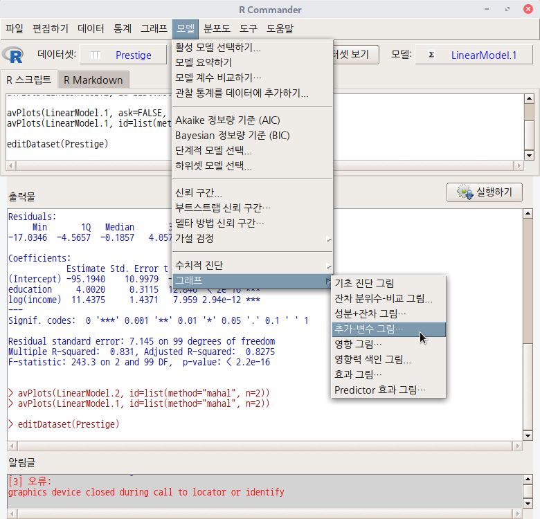
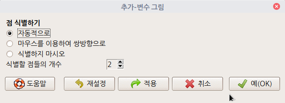
'모델 > 그래프 > 추가-변수 그림...' 메뉴 기능은 데이터셋이 활성화되고, 분석 모형이 만들어진 이후 사용할 수 있다. carData 패키지의 Prestige 데이터셋을 이용하여 연습해보자.


먼저, Prestige 데이터셋을 활성화 시키자. '데이터 > 패키지에 있는 데이터 > 첨부된 패키지에서 데이터셋 읽기...' 메뉴 기능을 선택하고, 다음 화면에서 carData 패키지에 포함된 데이터셋들 중에서 Prestige를 찾아서 선택한다. 그러면, R Commander 상단의 <활성 데이터셋 없음> 버튼이 'Prestige'로 바뀐다.


Prestige 데이터셋을 이용하여 LinearModel.1 모형을 만든다. '통계 > 적합성 모델 > 선형 모델...' 메뉴 기능을 이용할 수 있다.

LinearModel.1 <- lm(prestige ~ education + income, data=Prestige)
summary(LinearModel.1)

LinearModel.1 모형이 활성화된 이후, '모델 > 그래프 > 추가-변수 그림...' 메뉴 기능을 선택하면 아래와 같은 하위 화면이 등장한다.

Linux 사례 (MX 21)

기본 설정으로 추천된 사항들을 그대로 사용하자. 예(OK) 버튼을 누른다.

avPlots(LinearModel.1, id=list(method="mahal", n=2))

Linux 사례 (MX 21)


회귀선에서 멀리 떨어져 있다고 추천된 2개의 사례들을 Prestige 데이터셋에서 제거해보자. general.managers가 중복되기 때문에 모두 3개의 사례가 삭제된다. 사례 삭제는 R Commander 상단에 있는 <데이터셋 편집하기> 버튼을 누르고 해당 사례를 찾아 삭제하는 방식을 취했다.


LinearModel.2 <- lm(prestige ~ education + income, data=Prestige)
summary(LinearModel.2)

Linux 사례 (MX 21)

앞서 만든 LinearModel.1과 비교해보자.

Linux 사례 (MX 21)

avPlots() 함수를 이용하여 새롭게 만든 LinearModel.2의 실제 회귀계수를 앞서 만든 그래프와 비교해보자.

Linux 사례 (MX 21)

'Models > Graphs' 카테고리의 다른 글

6. Influence index plot...  (0) 2022.06.21
2. Residual quantile-comparison plot...  (0) 2022.06.21
5. Influence plot...  (0) 2022.06.21
3. Component + residual plots...  (0) 2022.06.20
7. Effect plots...  (0) 2022.03.09

모델 > 그래프 > 성분 + 잔차 그림...

Models > Graphs > Component + residual plots...

Linux 사례 (MX 21)

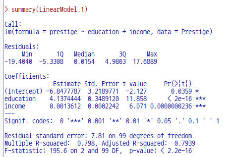
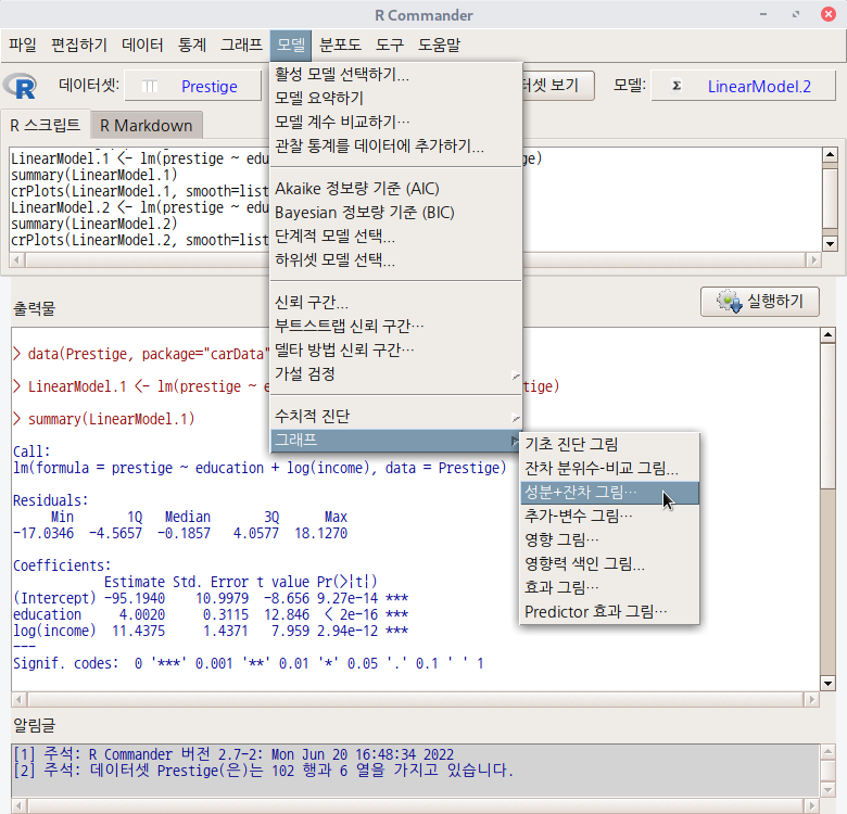
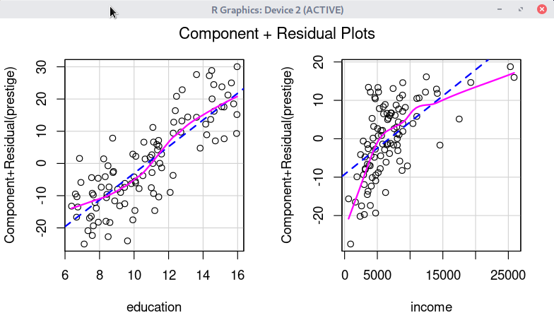
데이터셋이 활성화되고 통계적으로 분석된 모형이 만들어진 경우, '모델 > 그래프 > 성분 + 잔차 그림...' 메뉴 기능을 사용할 수 있다. carData 패키지의 Prestige 데이터셋을 이용하여 연습해보자.


먼저 Prestige 데이터셋을 활성화 시킨다. '데이터 > 패키지에 있는 데이터 > 첨부된 패키지에서 데이터셋 읽기...' 메뉴 기능을 통해서 carData 패키지에서 Prestige 데이터셋을 찾아서 선택하면 된다. 그러면, R Commander 상단의 <활성 데이터셋 없음> 버튼이 'Prestige'로 바뀐다.


Prestige 데이터셋을 이용하여 LinearModel.1, LinearModel.2 라는 두 개의 모형을 차례로 만든다. '통계 > 적합성 모델 > 선형 모델...' 메뉴 기능을 이용할 수 있다.


LinearModel.1 <- lm(prestige ~ education + log(income), data=Prestige)
summary(LinearModel.1)
LinearModel.2 <- lm(prestige ~ education + income, data=Prestige)
summary(LinearModel.2)

그리고 두 모형의 '성분 + 잔차 그림...'을 차례로 만든다. 먼저 R Commander 상단의 <모델: LinearModel.1> 을 선택한 후, '모델 > 그래프 > 성분 + 잔차 그림...' 메뉴 기능을 선택한다.


crPlots(LinearModel.1, smooth=list(span=0.5))

Linux 사례 (MX 21)

crPlots(LinearModel.2, smooth=list(span=0.5))

Linux 사례 (MX 21)

'Models > Graphs' 카테고리의 다른 글

6. Influence index plot...  (0) 2022.06.21
2. Residual quantile-comparison plot...  (0) 2022.06.21
5. Influence plot...  (0) 2022.06.21
4. Added-variable plots...  (0) 2022.06.20
7. Effect plots...  (0) 2022.03.09

모델 > 수치적 진단 > 변환 반응하기...

Models > Numerical diagnostics > Response transformation...

Linux 사례 (MX 21)

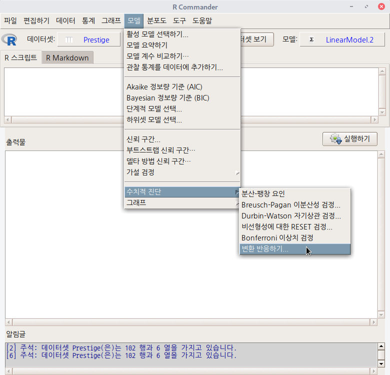
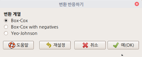
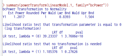
어느 데이터셋이 활성화되고, 그 데이터셋을 활용한 분석 모형이 만들어지면, '모델 > 수치적 진단 > 변환 반응하기...' 메뉴 창이 활성화된다.


carData 패키지의 Prestige 데이터셋을 이용하여 연습해보자. 먼저 Prestige 데이터셋을 활성화시킨다. '데이터 > 패키지에 있는 데이터 > 첨부된 패키지에서 데이터셋 읽기...' 메뉴 기능을 통하여 carData 패키지에서 Prestige 데이터셋을 찾아서 선택한다. 다음, Prestige 데이터셋을 활용하여 선형 모델을 만든다. '통계 > 적합성 모델 > 선형 모델...' 메뉴 기능을 선택하여 모형을 만든다.

data(Prestige, package="carData")
LinearModel.1 <- lm(prestige ~ education + income, data=Prestige)
summary(LinearModel.1)

'모델 > 수치적 진단> 변환 반응하기...'메뉴 기능을 선택하면, 다음과 같은 하위 메뉴창이 등장한다. 기본 설정을 이용하자. 예(OK) 버튼을 누른다.

Linux 사례 (MX 21)
Linux 사례 (MX 21)


선형 모델을 구성하는 어느 설명변수 또는 설명변수들의 정규성을 향한 변환 기법은 '통계 > 요약 > 정규성을 향해서 변환시키기...' 메뉴 기능을 통해서 연습할 수 있다. 

https://rcmdr.tistory.com/198


9. Transform toward normality...

통계 > 요약 > 정규성을 향해서 변환시키기... Statistics > Summaries > Transform toward normaltiy... 어느 데이터셋을 활성화시키면, '통계 > 요약 > 정규성을 향해서 변환시키기...' 메뉴 기능이 아래와 같이..

rcmdr.kr

한편, 위에 있는 선형 모델, LinearModel.1의 반응변수의 변환 값은 1.2017(Est Power)이다. 이 값을 이용하여 모형을 보다 최적화하는 방법은 아래와 같다.

LM.1_pT <- powerTransform(LinearModel.1, family="bcPower")
LinearModel.1_pT <- lm(bcPower(prestige, LM.1_pT$roundlam) ~ education + income, data=Prestige)
summary(LinearModel.1_pT)   #LinearModel.1의 변환 모형 요약 정보
summary(LinearModel.1)      #LinearModel.1의 요약 정보

bcPower(Prestige$prestige, LM.1_pT$roundlam)  # 변환된 prestige 변수 사례 값
Prestige$prestige                             # 원래의 prestige 변수 사례 값

'Models > Numerical diagnostics' 카테고리의 다른 글

3. Durbin-Watson test for autocorrelation...  (0) 2022.06.21
4. RESET test for nonlinearity...  (0) 2022.06.20
5. Bonferroni outlier test  (0) 2022.06.18
1. Variance-inflation factors  (0) 2022.06.14

+ Recent posts