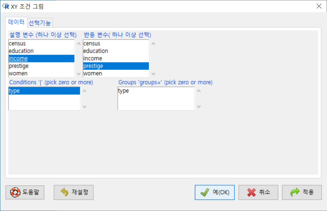
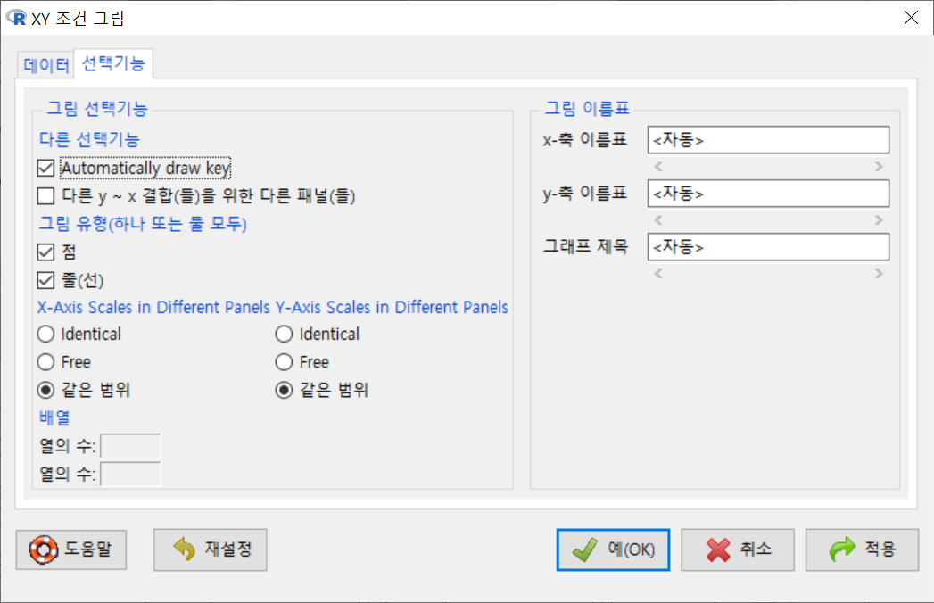
그래프 > XY 조건 그림...
Graphs > XY conditioning plot...
carData 패키지의 Prestige 데이터셋을 활성화시키자. 연소득과 직업의 사회적귄위에 대한 이해를 확대하고자 income, prestige 변수의 연관성에 대하여 시각적으로 점검한다고 하자. bc, prof, wc라는 수준을 가진 요인형 변수 type을 집단화시켜 시각화에 포함시키자.
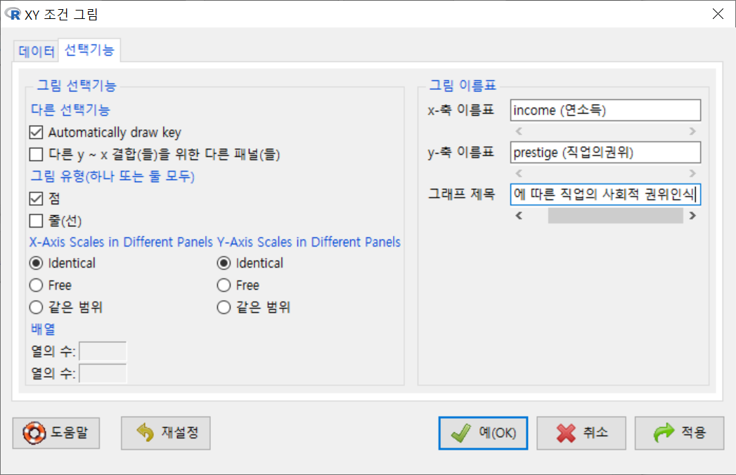
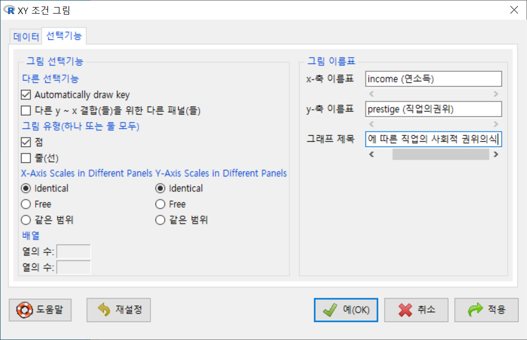
<선택기능> 창에 있는 많은 선택 기능은 기본설정으로 놓고 오른쪽의 <그림 이름표>에 그래프의 내용적 이해를 높이고자 관련 사항을 추가적으로 입력하자.
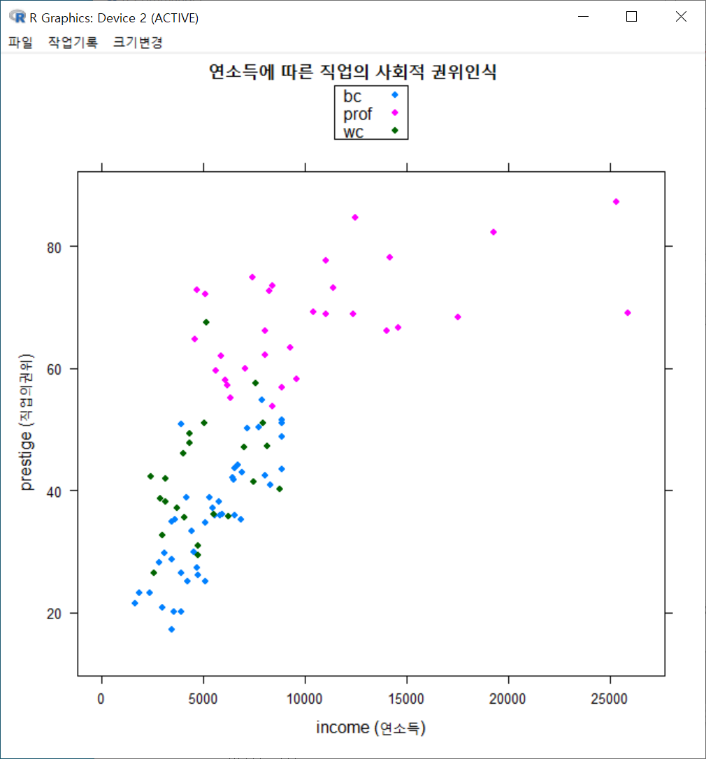
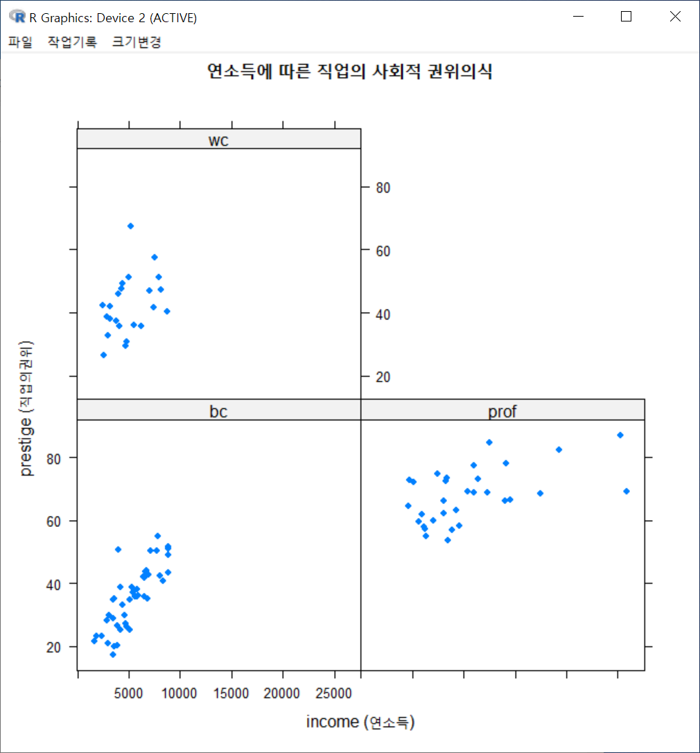
xyplot(prestige ~ income, groups=type, type="p", pch=16,
  auto.key=list(border=TRUE), par.settings=simpleTheme(pch=16),
  scales=list(x=list(relation='same'), y=list(relation='same')), data=Prestige,
  xlab="income (연소득)", ylab="prestige (직업의권위)", main="연소득에 따른 직업의 사회적 권위인식")
그래픽장치 창에 아래와 같은 그래프가 출력된다. 직업유형을 뜻하는 type 변수의 수준인 bc, prof, wc 수준의 범례가 보인다. 그리고 그 색깔별로 점들이 찍혀 있어, 추가적인 이해를 제공한다.
아래 그림은 직업유형 변수인 type을 "Groups 'groups='에서 해제하고, Conditions'|'에 선택한다.
<선택기능>창의 오른쪽에 있는 <그림 이름표>에 내용적인 이해를 높이는 이름표과 제목을 넣자.
xyplot(prestige ~ income | type, type="p", pch=16, auto.key=list(border=TRUE),
   par.settings=simpleTheme(pch=16), scales=list(x=list(relation='same'),
  y=list(relation='same')), data=Prestige, xlab="income (연소득)", ylab="prestige
  (직업의권위)", main="연소득에 따른 직업의 사회적 권위의식")
아래에 있는 그래픽장치 창은 위에 있는 그래픽장치 창과 달리 직업유형별(bc, prof, wc)별로 산점도가 각각 제작된다.
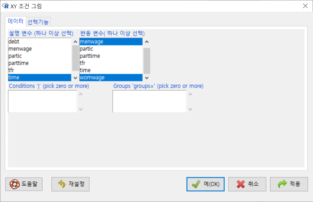
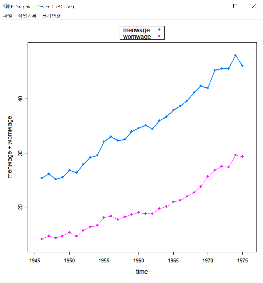
xyplot() 함수는 시계열적 수치형 변수와 관련해서는 lineplot()과 유사하게 그래프를 출력할 수 있다. carData 패키지의 Bfox의 사례를 수치형 time 변수로 변환시키고 그래프를 만들어보자.
<선택기능> 창에 있는 <그림 유형(하나 또는 둘 모두)>에 점/줄(선) 모두 선택해보자. 물론 <그림 이름표>에 내용을 추가할 수도 있다.
xyplot(menwage + womwage ~ time, type=c("p", "l"), pch=16, auto.key=list(border=TRUE),
	par.settings=simpleTheme(pch=16), scales=list(x=list(relation='same'),
	y=list(relation='same')), data=Bfox)
시간의 흐름에 따른 수치형 변수들의 변화 흐름을 파악할 수 있다. 주의해야할 점은 두개 이상의 수치형 변수를 그래프에 모두 넣을 경우, 각 변수들의 사례 기준(크기, 비율 등)이 동일해야 시각화가 특징을 잡아내는데 효과적이다.
?xyplot  # lattice 패키지의 xyplot 도움말 보기

require(stats)

## Tonga Trench Earthquakes

Depth <- equal.count(quakes$depth, number=8, overlap=.1)
xyplot(lat ~ long | Depth, data = quakes)
update(trellis.last.object(),
       strip = strip.custom(strip.names = TRUE, strip.levels = TRUE),
       par.strip.text = list(cex = 0.75),
       aspect = "iso")

## Examples with data from `Visualizing Data' (Cleveland, 1993) obtained
## from http://cm.bell-labs.com/cm/ms/departments/sia/wsc/

EE <- equal.count(ethanol$E, number=9, overlap=1/4)

## Constructing panel functions on the fly; prepanel
xyplot(NOx ~ C | EE, data = ethanol,
       prepanel = function(x, y) prepanel.loess(x, y, span = 1),
       xlab = "Compression Ratio", ylab = "NOx (micrograms/J)",
       panel = function(x, y) {
           panel.grid(h = -1, v = 2)
           panel.xyplot(x, y)
           panel.loess(x, y, span=1)
       },
       aspect = "xy")

## Extended formula interface

xyplot(Sepal.Length + Sepal.Width ~ Petal.Length + Petal.Width | Species,
       data = iris, scales = "free", layout = c(2, 2),
       auto.key = list(x = .6, y = .7, corner = c(0, 0)))


## user defined panel functions

states <- data.frame(state.x77,
                     state.name = dimnames(state.x77)[[1]],
                     state.region = state.region)
xyplot(Murder ~ Population | state.region, data = states,
       groups = state.name,
       panel = function(x, y, subscripts, groups) {
           ltext(x = x, y = y, labels = groups[subscripts], cex=1,
                 fontfamily = "HersheySans")
       })

## Stacked bar chart

barchart(yield ~ variety | site, data = barley,
         groups = year, layout = c(1,6), stack = TRUE,
         auto.key = list(space = "right"),
         ylab = "Barley Yield (bushels/acre)",
         scales = list(x = list(rot = 45)))

bwplot(voice.part ~ height, data=singer, xlab="Height (inches)")

dotplot(variety ~ yield | year * site, data=barley)

## Grouped dot plot showing anomaly at Morris

dotplot(variety ~ yield | site, data = barley, groups = year,
        key = simpleKey(levels(barley$year), space = "right"),
        xlab = "Barley Yield (bushels/acre) ",
        aspect=0.5, layout = c(1,6), ylab=NULL)

stripplot(voice.part ~ jitter(height), data = singer, aspect = 1,
          jitter.data = TRUE, xlab = "Height (inches)")

## Interaction Plot

xyplot(decrease ~ treatment, OrchardSprays, groups = rowpos,
       type = "a",
       auto.key =
       list(space = "right", points = FALSE, lines = TRUE))

## longer version with no x-ticks

## Not run:
bwplot(decrease ~ treatment, OrchardSprays, groups = rowpos,
       panel = "panel.superpose",
       panel.groups = "panel.linejoin",
       xlab = "treatment",
       key = list(lines = Rows(trellis.par.get("superpose.line"),
                  c(1:7, 1)),
                  text = list(lab = as.character(unique(OrchardSprays$rowpos))),
                  columns = 4, title = "Row position"))

## End(Not run)